This blog is cross posted on Information Systems for Environmental Sustianability
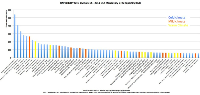
I scraped the EPA website for University GHG emissions (not available for download), made a bar chart excluding those with < 50K MTCo2e in 2011, and added colors to group by climate (my own eyeballing of cold, mild, warm):
Some things to note:
- This is not normalized on a per capita or area basis, so comparisons are tentative.
- Top 5 emitters (MSU, Purdue, Iowa State, Michigan, Illinois) are all in the midwest.
- UCLA is the largest emitter in a warm climate.
- Given the nature of the data, it is unclear whether reported emissions derive from generated electricity, heating, or cooling (or other stationary sources?)
- Not inculded in the chart are a few universities that reported with fewer than 25K (rule minimum). Not sure why this is.
- Certain cold weather climate unis have far lower emissions (BU at 53,900) versus others in cold climates (Purdue at 408,928), probably due to how they heat buildings (but I don’t have data to back this claim up).
Thanks to the EPA for making these data visually available. Also, thanks for their ruling that these data are not confidential (allows them to release to the public). It would be great to have better analytics – top of my list would be some kind of normalization to allow for apples to apples comparisons (by sq. ft. or by heat production technology or something).
